Branding For President, Volume 2
Branding For President is a series in which we take a look at the 2016 presidential candidates and how they use graphic design to speak to their target audience.
In Volume 1 of this series, we tackled the campaigns of Hillary Clinton, Ted Cruz, Rand Paul and Marco Rubio and found some pretty odd choices in their branding and logo design. It's time to take a look at four more politicians who have recently declared their candidacy.
Here we go, in alphabetical order:
Ben Carson
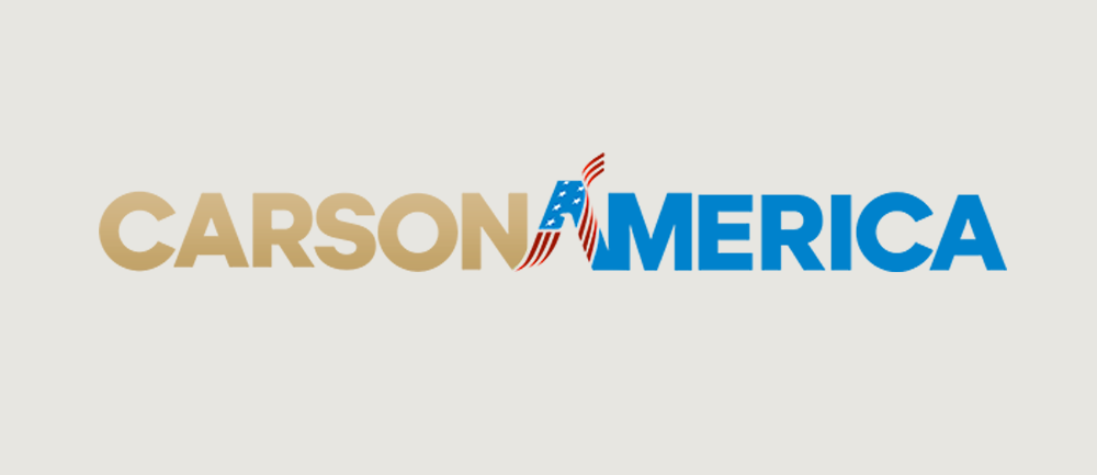
Ben Carson is a bit of a Washington DC outsider, so it makes sense that his logo is a bit on the unconventional side.
Ben's team has chosen "CarsonAmerica" which I find to be a bit awkward. What exactly are they trying to say here? Carson's America? Carson for America? Nope, just CarsonAmerica, apparently. I also find it odd that a marginal candidate with very little name recognition would decide against putting his full name on the logo.
They've chosen a confident geometric typeface that to my eyes is really close to Lulo Clean Bold, a font that certainly welcomes comparisons to Gotham, which was popularized by Obama in his 2012 campaign (change we can believe in!). Interesting choice for a conservative, but it doesn't bother me.
CARSON is presented in a drab tan color with a subtle gradient. I assume they're going for gold, but the treatment fails to deliver the necessary shine to evoke a metallic finish. It's not working for me. The blue in AMERICA is quite nice, and the slight bump in size given to the first A gives the logo some balance. They've gone a bit heavy-handed with the symbolism though—the A doesn't need both a draped flag and an eagle hiding in the negative space.
Carly Fiorina
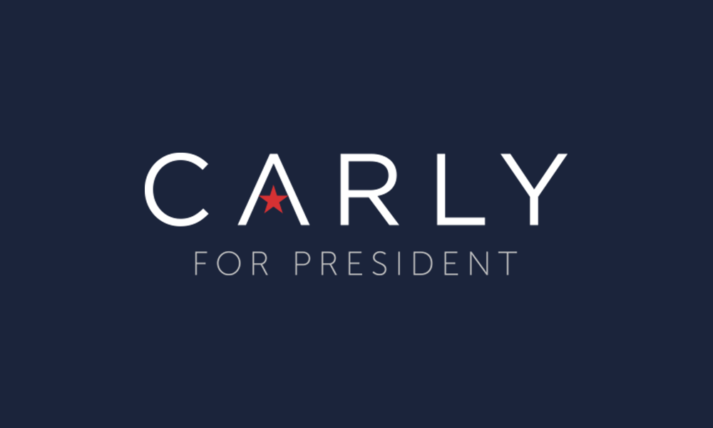
Carly Fiorina is a former business executive running for president as a Republican, and like Ben Carson, has little experience in politics.
Her team has gone first-name-only, which feels to me like a play to her femininity. Just "CARLY"... no need for a last name to obfuscate things (though I'd argue that, like Ben Carson, she's likely to burn herself here due to her lack of name recognition).
She's attempting to court the female vote in the font selection and type treatment as well. The team has selected a delicate weight of Gotham (Gotham Book), tracked out wide. The color choices of navy and red project act as a good counter-balance, projecting a seriousness that is lacking in the letterforms.
Overall there's little to dislike here, although I find the star in the A to be a bit forced and generic. I think she's doing a pretty good job of speaking to her target audience without alienating anyone else.
Mike Huckabee
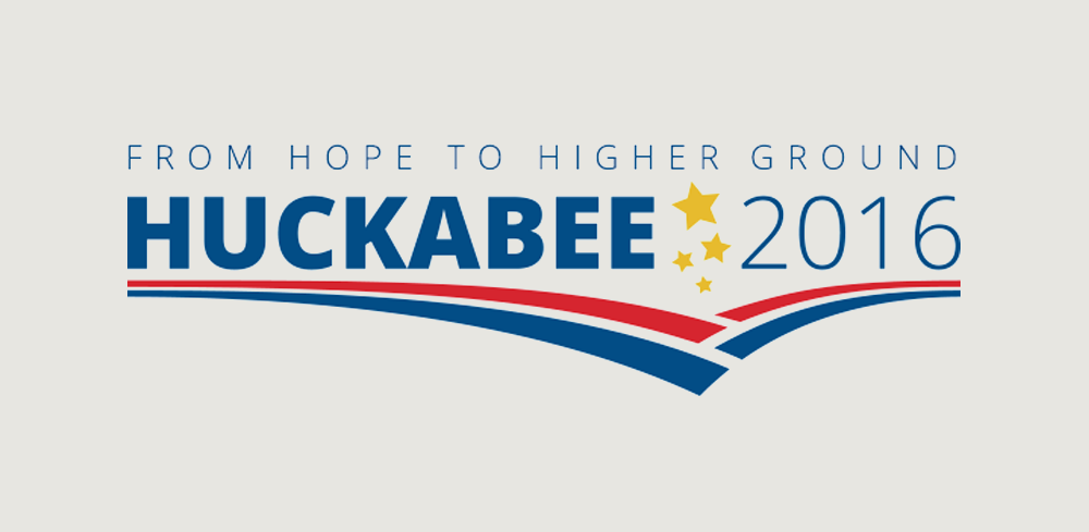
Mike Huckabee has been heavily involved in politics for years. He's a former governor of Arkansas who gained a fair amount of attention on the national stage in his failed bid for the Republican nomination in 2008. Since then, his visibility has been boosted through his time as a host and political analyst on Fox News.
So, the good news is that he's got the name recognition to make "HUCKABEE 2016" work. The bad news is nearly everything else.
His slogan is "From Hope to Higher Ground," which just happens to be the name of the autobiography he released in coordination with his 2008 campaign. His reuse of that slogan makes me think that he's learned very little since his failed bid, and that he's marketing his book as much as his candidacy. And for those of us who didn't know he was born in Hope, Arkansas (which included me as of one hour ago), the phrase really doesn't make a whole lot of sense.
His team has gone with a poorly-kerned generic sans-serif font (looks very much like Rleud Heavy to me) with tacked-on stars accompanied by some lines that would look more appropriate on a track shoe. Well I guess he IS running.
Next!
Bernie Sanders
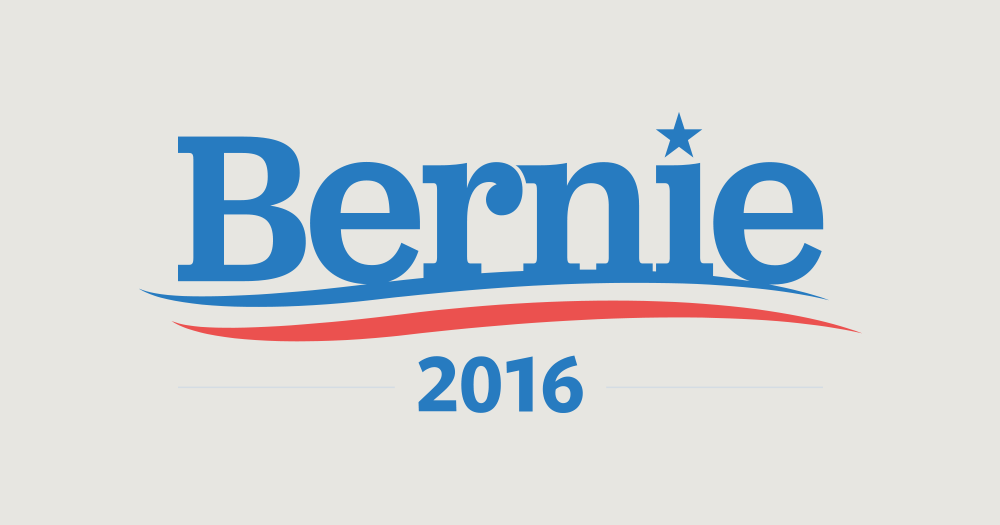
Oh dear.
For the record, I kinda like Bernie Sanders. He's like that goofy but opinionated uncle you have who always tells you exactly what's on his mind, and that's refreshing for a man in Bernie's position. He represents Vermont in the US Senate as an Independent, but generally caucuses with the Democrats. He's also one of the few national politicans who embraces the term "socialist" and is desperate to have his views (which are considered a bit radical by US standards) taken seriously.
Which leads us to his branding choices. The use of only the first name "Bernie" and the casual typeface seem to support that image of, well... that goofy but opinionated uncle of yours. I'd say the typeface actually does a pretty good job of representing his personality, but does a poor job of representing him as someone who should be taken seriously.
 Also, I can't help but see a lego head with an Elvis hairdo in the negative space between the r and the n.
Finally, the star on the i and the tri-color toothpaste swoosh aren't helping things.
That's all for today. I'm looking forward to the next four candidates!
Comments
Add a Comment