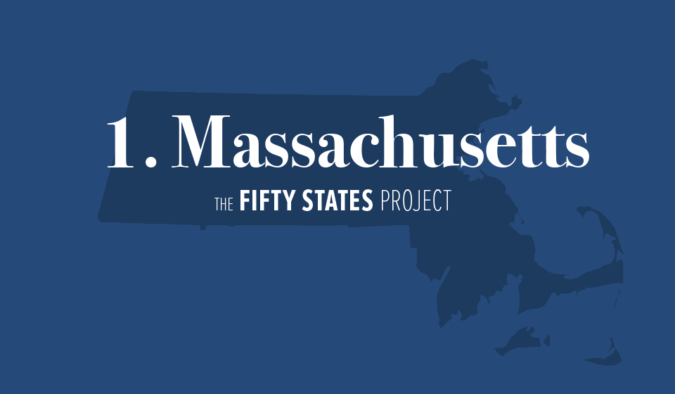
The Fifty States Project: Massachusetts
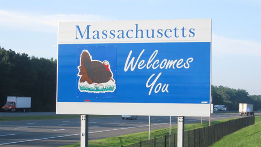
The Fifty States Project is an exercise to keep my creative juices flowing. The idea is to create a new welcome sign for each state, incorporating the state's identity into the design. Click here for the Fifty States introduction.
The first stop on my journey across the fifty states is Massachusetts, my home. I grew up in Philadelphia, but moved here to go to college and, like so many others before me, I enjoyed the area so much that I chose to stay after my studies were complete. I fell in love with autumn in New England, the rich history and culture, and of course the Red Sox. I suppose my decision to stay here wasn't too much of a surprise, given my lifelong tepid enthusiasm for the Philadelphia sports teams (though I've still got a soft spot in my heart for the Phillies).
So what gives Massachusetts its identity? Its liberal population? High property taxes? Baked beans? Michael Dukakis?
I think that the rich history of The Bay State contributes more to its identity than everything else. After all, this is the place to which pilgrims journeyed from England on the Mayflower in 1620. And when patriots in Massachusetts rebelled against the British in 1775, they became the catalyst for the American Revolutionary War. In fact, I'd argue that there is no state that has been more influential in the forming of the United States of America than Massachusetts.
Typography
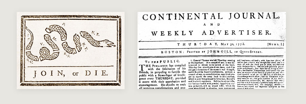
How can we convey a sense of history in our sign? One great place to start is typography. One common motif you'll often see in Revolutionary War-era printed materials is heavy use of all caps in a serif font with wide spacing (or tracking) in between the letters.
Color Palette

Above I have collected a few meaningful colors for Massachusetts. First we've got a nice dark navy (Red Sox blue), a slightly lighter and more saturated blue (American flag blue), a scarlet red (American flag red) and a gold color that is used in the state seal.
I decided to base the design around the darker shade of blue for a couple of reasons. The fact that it is not quite so saturated gives it more of an antique feel to it. Also, it is probably a bit closer to the blue worn by the Patriots during the Revolutionary War. I considered integrating the red or gold as an accent color, but preferred the monochromatic aesthetic.
The Slogan
So, as far as I'm concerned there's really two options here, The Bay State and The Spirit of America. Yes, The Spirit of America was actually a tourism slogan from the 80s, but if it's good enough for Massachusetts' license plates, it's good enough for me!
Additional Inspiration
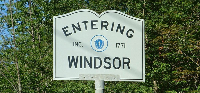
I'd be remiss to ignore the ubiquitous town signs scattered throughout the state (pictured above). These signs are everywhere. The open-book profile has changed a bit over the years, but the shape is quintessential Massachusetts. Hooray for the pursuit of knowledge! I also like the incorporation of the establishment date.
Finally, I wanted to incorporate a subtle visual reference to the establishment of the United States, so I worked in the circular arrangement of stars representing the original 13 colonies from the "Betsy Ross" flag.
Final Design

That was fun. Up next is my birthplace of Pennsylvania. Stay tuned!
Comments
Add a Comment