Branding For President, Volume 3
Branding For President is a series in which we take a look at the 2016 presidential candidates and how they use graphic design to speak to their target audience.
Well, we've seen some interesting campaign logos so far, and the candidates are jumping into the race faster than I can write about them! There are now upwards of 20 major party candidates who are well-known enough to get some level of national media attention, and there are certainly more to come.
Let's get on with it.
Jeb Bush
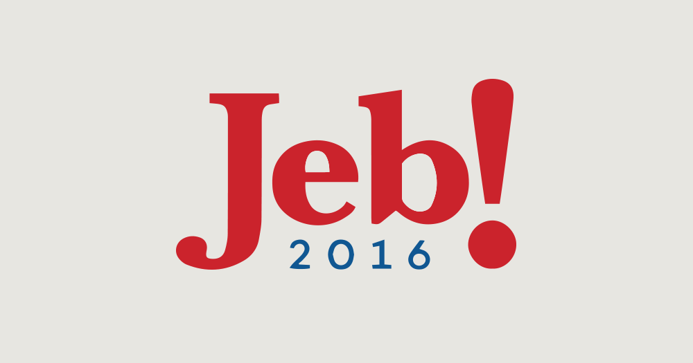
We're starting off with a doozy today. This logo has already been the subject of some intense media scrutiny and ridicule, so I'll try to be kind.
So, we've got "Jeb!" in what looks like some tightly kerned Baskerville Bold. First, it's worth noting that Jeb Bush in large part has his ancestry to thank for his rise to fame as a politician, which I suppose makes it all the more interesting that he has left his surname off of the logo. However, given the track record of his brother and the overall Bush fatigue that has taken hold on the public, the omission might just be a good idea.
What's not a good idea is the comically large exclamation point. This logo reeks of a casual goofiness that would be better suited for a sitcom or a board game than a presidential campaign. Come on, Jeb!
I think that exclamation point grows every time I look at it. It's not helping that it apparently isn't vertically aligned with anything.
Moving on...
Bobby Jindal

Bobby Jindal is the conservative governor of Louisiana and a bit of a long-shot to win the Republican nomination, and his logo is a bit of a disaster.
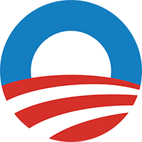
It won't speak effectively to his target audience, I'm afraid. The typeface is sleek, modern and progressive (my money's on Avenir Book), and comes off a bit timid and dainty. His stylized J was obviously inspired by Obama's O. I understand the Jindal team's desire to follow the roadmap of a proven successful brand, but the end result is one that just looks forced and amateurish. And it looks a bit like a candy cane.
Martin O'Malley
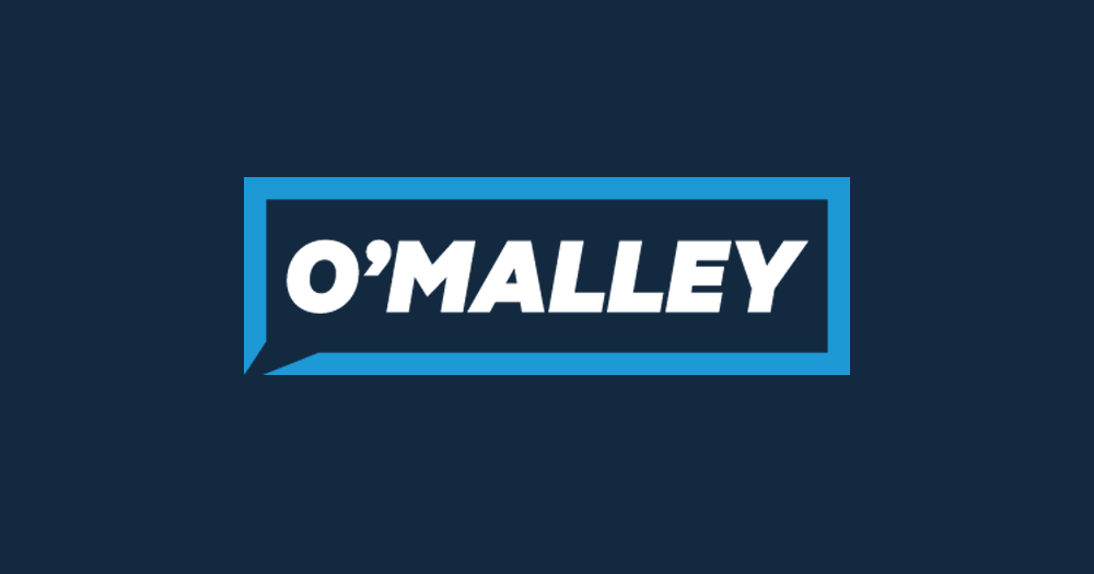
Now we're talking. Here's a logo that is unique and interesting without making my eyes bleed. My only issue with it is... who's O'Malley? This logo could use just a little more context to ground it.
Here's what works though... it's a great modern-but-classic font (looks like Nexa Black or Galano Classic Black, but even heavier) with nice tight kerning, and the oblique treatment is a nice choice to convey excitement and forward motion. The typeface is bold and confident, and the logo's color palette is very Democratic but unique enough to set him apart from the competition.
The border with the corner cutout is unique and effective as well, conveying open dialog and excitement, without bashing your head with an exclamation point (Jeb!, take note!).
Rick Santorum
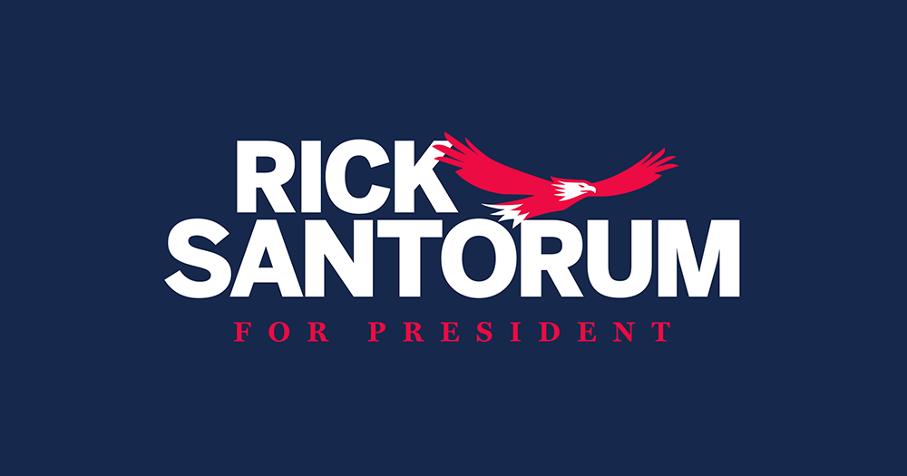
After Rick Santorum's failed 2012 nomination bid, the eagle returns!
In some ways, Rick Santorum's 2016 effort is an improvement. It no longer spells out "Rick Sant Rum", so that's a big plus. I'd say that the typography isn't bad. The generic sans-serif font is a little uninspired, but layout is interesting, and I like the inclusion of the bold and wide-tracked serif for the "For President" tag.
The color choice is certainly interesting. I can't decide if that is a pinkish red or a reddish pink, but either way, it's an odd choice for a presidential campaign.
Finally, while the eagle is a meaningful (if a bit unimaginative) symbol for inclusion in the logo, its execution misses the mark for me. The classic American bald eagle is magestic, pure and confident. Santorum's eagle just looks a little... ill-tempered.
That's all for now!
Comments
Add a Comment