Branding For President, Volume 1
'Tis the season for presidential campaigns to begin. After all, November 8, 2016 is less than 19 months away! You can almost smell the pandering in the air. Today I take a look at the first four candidates and how they're using graphic design to speak to their audiences.
Here we go, in alphabetical order...
Hillary Clinton
Hillary Clinton's logo is certainly garnering the most passionate response. Reception has been decidedly mixed, but everyone seems to have an opinion of it. Notice now nobody's talking about Ted Cruz's or Rand Paul's logos. The buzz that Hillary's logo has generated (even the negative buzz) is good news for her campaign.
We've got a boring blocky and blue H with a big red arrow. What's going on here? Why are people making such a fuss? The big reason is that Hillary's logo is a pretty huge departure from most campaign logos (for better or worse). It's unabashedly flat and minimalist. Hell, it doesn't even have her name on it! Even on her web site, you have to scroll down to the copy to see the first mention of her name.
This was a gamble and I think it's paying off. The more this logo pops up on social media and news sites, the more it begins to stand on its own. She doesn't need her name on it, we all know who she is.
We can complain all we want about the Chromostereopsis effect that the gaudy red-on-blue shapes have on our eyes. We can sit here and laugh about the lunacy of a Democrat using a red arrow pointing to the right. We can scoff at the logo's childlike simplicity and compare it to the universal Hospital sign. But none of the criticism matters if the country is talking about it and that damn H is burned into our retinas.
Okay, moving on...
Ted Cruz
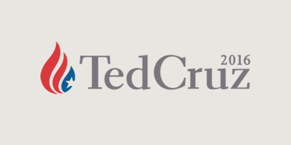
Here's the good news. It's a pretty nice font (not sure what it is, but it's very similar to Electra Bold). It's a serif font, which supports his conservative ideals, but it has a bit of a modern edge to it. The medium gray is pretty bland but I don't hate it. Overall, the typography is pretty good.
The trouble lies with the symbol flanking the text. Some see the shape as a drop of water. Most (myself included) see a flame, which is more likely—after all, Cruz's campaign motto is "Reigniting the Promise of America." The question becomes... if the symbol is indeed supposed to be a flame, why on earth would you make it an upside-down American flag? Ted doesn't seem like the flag-burning type.
Overall it's a pleasant enough logo to look at—the colors and shapes are very nice. But I have to question the thought process of turning the American flag into a flame.
Rand Paul
Next up is Rand Paul. Bold and oblique, and all uppercase. First name only. There's a good bit to like about this one. It certainly projects strength and confidence and he's applying a nifty use of negative space between the A and the N for the handle of the torch. I like that he isn't bothering with the last name. "Rand" is unique enough to stand on its own ("Stand with Rand!").
The font (dangerously close to Obama's Gotham) is decidedly not conservative, perhaps indicating that Rand is his own man. It'll be interesting to see how that plays out to the conservative base.
I think the biggest letdown of this logo is the flame. It could certainly use a little tweaking to make it more... fiery? I don't know—I keep seeing the hairdo of Philip J. Fry. Further, the torch is reminiscent of a paintbrush dipped in red, giving the logo more of an art supply feel to it than a presidential candidate.
Marco Rubio
Finally, we come to Marco Rubio. This, in my opinion, is the worst of the bunch. It's just pure lazy. All lowercase geometric sans-serif (looks to me like Avant Garde Demi with a taller ascender and bad kerning). Trying desperately to be modern and trendy, he'd be better positioned to open up a furniture store than a presidential campaign. This will not appeal to his conservative base.
Oh, and he chooses to dot the i with the shape of our great country? That's just treasonous. Have some respect, man!
Comments
Add a Comment